Website designs: Responsive, dynamic, or separate domain
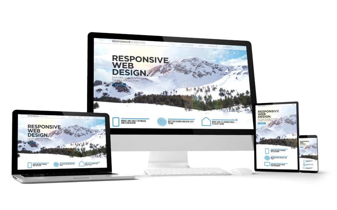
When you start designing the mobile site, you have three choices: dynamic service, a separate domain or a responsive design.
Google prefers a responsive website design as you have one site that adapts to the device it is used on. It is easy to maintain and has only one code base. According to Google, a responsive design is more likely for addition in the new mobile-first indexing. You should always add the meta name=”viewport” declaration in the head of your documents to let Google know that your site is mobile-friendly.

In the dynamic serving website design, server detects users device type and serves the appropriate version of your site. While they use the same URL, the files that are displayed are completely different between the mobile version and the desktop version. You should add the Vary header to let Google crawl your website as this will let Google identify that it has received mobile-optimized files.

When you use a separate domain, you typically design your site on a m.subdomain. It is a completely separate version of your site. Similar to dynamic, all the files are different between mobile version and desktop version. Google supports this version only if you make the connections between your mobile domain and regular desktop domain. Use rel=”alternate” and rel=”canonical” to show Google how these pages are connected.
The dynamic serving and separate mobile site methods make the optimization process hard. There are so many different files involved and you need to do every task multiple times. Maintenance is also hard with so many files.
When you use responsive design, you design a single site with a single version of each page. Responsive CSS coding makes your content “fluid”, it changes according to the device that views the site. When you are writing content and optimizing a page with responsive design, you need to do it once and thus it makes SEO much easier.
To design mobile sites, Google prefers and recommends responsive design. With the help of this design, you get a single version for each file. It provides the best user experience regardless of the device being used for searches.
How to improve mobile site speed?
After designing a mobile-friendly site, the most important factor of mobile SEO is page speed. Page Speed Insights is extremely helpful in showing how fast the mobile and desktop versions of your website load. It also recommends ways to improve site performance. Using additional tools like Google Search Console’s Core Web Vitals to analyze how your site is performing.
Three Core Web Vitals metrics analyzed by Page Speed Insights include:
- CLP (largest contentful paint): This occurs when the largest part of a website’s requested page is shown on the screen. If your website has a high CLP grade, that means your site loads quickly. Slow load speed can cause dissatisfaction among users.
- FID (first input delay): This metric focuses on the time between a user’s first interaction with a requested web page and the browser’s reaction to that input. It is essential whether a website reacts to an input in a fast and responsive way.
- CLS (cumulative layout shift): This metric measures the total movement time on the screen while the website is loading. This provides an idea of the things that are happening around making the site jerky.
Whenever you type your URL, Insights will give you scores for the mobile and desktop versions of the website. If the Insights report gives you a red score, you need to improve your website. An orange score depicts that your website’s performance is average and a green score indicates that the website is performing well. Insights will also offer recommendations on improving your website’s performance.
What are the do’s to improve site speed?
- Optimize your website’s images and use lesser images
- Invest in a high-quality hosting platform
- Check your redirects
- Update to PHP7 version
- Optimize critical rendering path
- Minify and optimize HTML, CSS, and JavaScript
- Use a Content Delivery Network (CDN)
- Prioritize visible content
- Optimize browser cache
- Transition to HTTP/2
- Fewer ad servers
- Upgrade to HTTPS
- Enhance server’s response time

Simply Diagnostics chooses WEBSITETOON to be its training provider and advisory for marketing and cybersecurity.
WEBSITETOON is proud to announce its new partnership with Simply Diagnostics, a leading Canadian medical laboratory testing provider known for its innovation, precision, and dedication to improving healthcare outcomes across the country. Simply Diagnostics has...

Washing Dynasty Partnered with WEBSITETOON for Digital Transformation and Marketing Excellence
We are delighted to announce our new partnership with Washing Dynasty, one of Canada’s most trusted names in professional laundry and dry-cleaning services. Founded in 1981, Washing Dynasty has set the benchmark for quality, reliability, and customer care across the...

WEBSITETOON selected to market ComfyComfy – Canada’s #1 Buckwheat Pillow Brand
We are delighted to announce our new collaboration with COMFYCOMFY, Canada’s #1 Buckwheat Pillow Brand, a company dedicated to improving lives by helping people achieve better and healthier sleep. This collaboration marks an exciting step in our journey to support...